Earlier Microsoft has announced that upcoming Windows Phone 8 will have Mobile version of Internet Explorer 10. IE10 have lots of improvements in terms of HTML5, JavaScript/ECMAScript support etc.
If you want your existing mobile websites to compatible to IE10 and you are using any User Agent(UA) detection logic to provide UA specific User Experience to the Website, here is the WP8 – IE10 User Agent details for your from the Official Windows Phone Blog:
User Agent Details for WP8 – IE10:
Mozilla/5.0 (compatible; MSIE 10.0; Windows Phone 8.0; Trident/6.0; ARM; Touch; IEMobile/10.0; <Manufacturer>; <Device> [;<Operator>])
Note: items enclosed in <> are optional entries specific to device, manufacturer and operator
Testing Compatibility in Desktop version of Internet Explorer 10
You can ensure your websites are compatible to different Windows Phone 8 resolutions in IE10 Mobile using the IE Developer Tools.
Follow the steps :
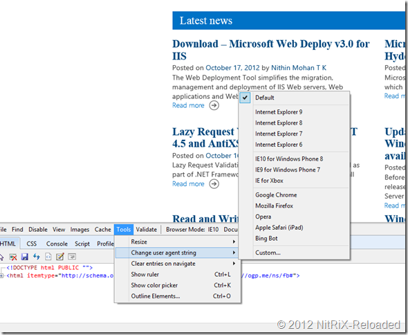
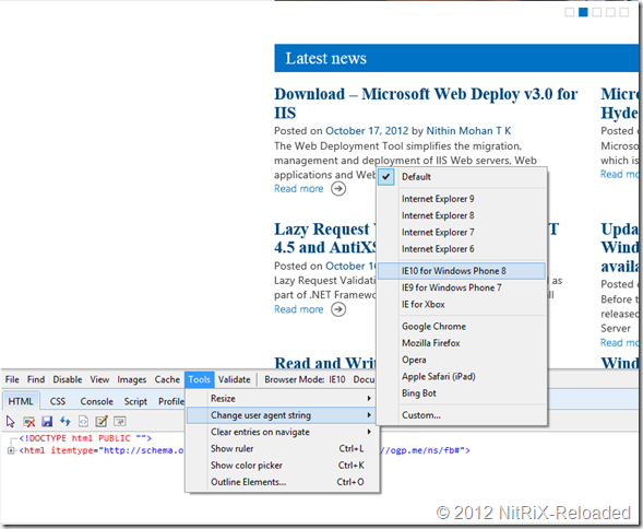
Step1: Set UA string
F12 Developer Tools -> Tools –> Change User Agent String –> select “IE for Windows Phone 8”
<code> <p><strong><u>Step 2: Set Resolution</u></strong> </p> <p>Since you set the UA to ‘IE10 for Windows Phone 8’, now it is the time to try out the different resolutions to see how your site looks in different resolutions of Windows Phone 8. For that you need to choose <em><font color="#c0504d">“F12 Developer Tools” –&gt; Tools –&gt; ‘Resize’ –&gt; Choose the different resolutions</font></em> for (portrait and landscape orientations your have different settings) and you could even specify the custom resolution.</p> <p><a href="http://www.nitrix-reloaded.com/wp-content/uploads/2012/10/image2.png"><img title="image" style="border-top: 0px; border-right: 0px; background-image: none; border-bottom: 0px; padding-top: 0px; padding-left: 0px; border-left: 0px; display: inline; padding-right: 0px" border="0" alt="image" src="http://www.nitrix-reloaded.com/wp-content/uploads/2012/10/image_thumb2.png" width="563" height="484" /></a></p> <p>As per the official announcement and demos earlier, Windows Phone 8 will support 3 different resolutions: </p> <p>800 x 480</p> <p>1280 x 720</p> <p>1280 x 768(WXGA)</p> <p>Set your resolution accordingly.</p> <p><a href="http://www.nitrix-reloaded.com/wp-content/uploads/2012/10/image3.png"><img title="image" style="border-top: 0px; border-right: 0px; background-image: none; border-bottom: 0px; padding-top: 0px; padding-left: 0px; border-left: 0px; display: inline; padding-right: 0px" border="0" alt="image" src="http://www.nitrix-reloaded.com/wp-content/uploads/2012/10/image_thumb3.png" width="578" height="484" /></a></p> <p>&#160;</p> <p>For the example I am setting the custom <font color="#c0504d">720p(1280 x 720)</font> resolution</p> <p><strong><u>Step 3: Refresh your website</u></strong> </p> <p>Now that you have done the necessary prerequisites to start, refresh your browser window. </p> <p>In the below example my blog is a Responsive Web enabled site, you could see the content has aligned for a mobile view.&#160; </p> <p>Continue <em><u>Step 2:</u></em> for trying more resolutions. <img class="wlEmoticon wlEmoticon-smile" style="border-top-style: none; border-left-style: none; border-bottom-style: none; border-right-style: none" alt="Smile" src="http://www.nitrix-reloaded.com/wp-content/uploads/2012/10/wlEmoticon-smile.png" /></p> <p>&#160;</p> <p><a href="http://www.nitrix-reloaded.com/wp-content/uploads/2012/10/image4.png"><img title="image" style="border-top: 0px; border-right: 0px; background-image: none; border-bottom: 0px; padding-top: 0px; padding-left: 0px; border-left: 0px; display: inline; padding-right: 0px" border="0" alt="image" src="http://www.nitrix-reloaded.com/wp-content/uploads/2012/10/image_thumb4.png" width="559" height="772" /></a></p> <p>Hope that helps. For more information and reference <a href="/wp-content/uploads/2012/10/getting-websites-ready-for-internet-explorer-10-on-windows-phone-8.aspx" target="_blank">Getting websites ready for Internet Explorer 10 on Windows Phone 8 by Charles Morris</a> (Windows Phone Blog) </code>


